ACPEN Catalog

Description
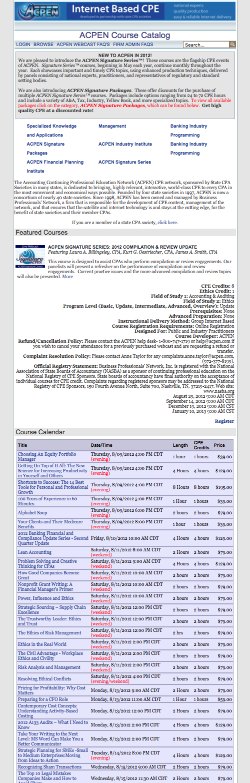
In my work for Business Professionals Network, I was asked to redesign the product catalog that end users use to purchase the CPE webcasts sold by the company.
The company had inherited a catalog based around a simple dynamic table listing the courses. Though this originally worked because of the limited number of course offerings, as the product offerings expanded over the course of several years, the original catalog had become difficult for users to browse. With the addition of so many courses, it became dense, overly text heavy, and not terribly aesthetically pleasing.
My primary goals in the redesign were:
- Make it easier for users to browse and filter courses.
- Make the catalog easier to skim by creating a clearer visual hierarchy.
- Reduce unnecessary text.
- Feature product line branding more prominently.
- Reduce the number of clicks required by the user to purchase.
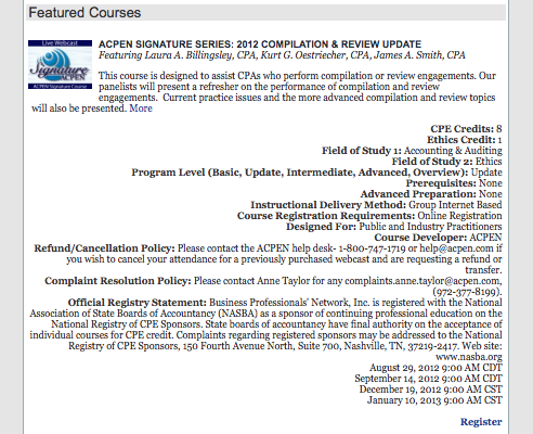
As such, the new catalog would add images for "featured categories" towards the top of the page to both improve branding visibility and make it easier for users to find those categories. The "featured courses" section was greatly reduced in terms of the amount of information displayed, thus reducing the vertical space devoted to them.
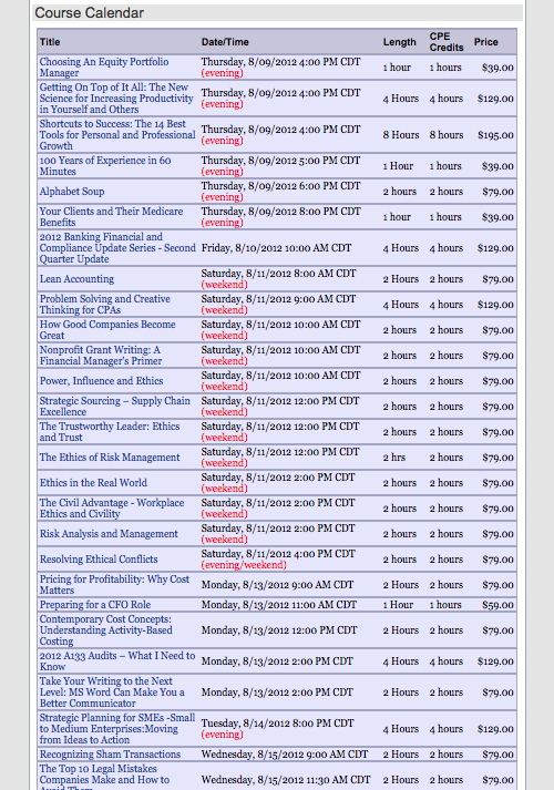
On the "course calendar" much was done to improve the visibility of the course title, in particular. As it is the most important part of the listing, it needed to become the most prominent. In addition, other information about the courses, such as being scheduled on the weekend, or at night, was converted to small icons, with descriptive hover-over tooltips, so as to reduce the overall amount of text and ease of skimming the catalog.
Perhaps most important, given the number and variety of courses, was the addition of filters to the calendar. The idea being to better serve the customer, by making it easy for end users to filter courses by whatever criteria mattered most to that individual.
Numerous other improvements were made throughout the catalog as well, primarily focusing on visual hierarchy. The process involved wireframing, creating mockups, revisions based on meetings with stakeholders, and consulting with developers.